top of page
PRE-PRODUCTION
AS DIRECTOR OF PHOTOGRAPHY

During Pre Production I mainly focused on colour theory and costume design as well as planning and preparing all of the equipment

Colour Theory
The first part of colour theory that is important to know it just the basics which is the colour wheel. Which is made up of the 3 primary colours, then the 3 secondary colours, then all of those colours can be mixed together to create all of the other colours.
The three main things you'll use during colour grading are:
HUE: This is kind of another word for colour and from this you can choose which colour you want and which shade of that colour.
SATURATION: This is how vibrant and rich the colour is
VALUE: This is how bright the shade of the colour is, something with a high value would be light and white, whilst
something with a low value would be dark and grey.
Complementary: This when you choose two colours which are directly opposite each other on the colour wheel, this is one of the most common selections for blockbuster films. One of the most popular colour schemes is teal and orange, which can be seen in so many films.
Analogous: This is the colour palette where you choose three colours which are next to each other in the colour wheel, this is normally for nature shoots and films with similar colour tones.
Monochromatic: This is when only one colour is chosen from the colour wheel, although this might sound simple it can have a really interesting effect on a film.
Based on this research, I'd really like to try a complementary colour palette and test out different colours and see what works the best for the visual storytelling. I want to have a colour grade that add impact and tension which will nicely compliment the story.

American Horror Story & Michael Goi Research
American Horror Story is one of the most interesting shows of recent times, mainly for its shocking content and graphic nature. Underneath all of the crazy content is a clever cinematic style which is due to Michael Goi who is the Director of Photography for the show.
Michael Goi started his career working with John Strysik on a short horror film in 1980. He is best known for his work with Ryan Murphy and Brad Falchuk on Glee, Scream Queens and American Horror Story. Goi has won Emmy awards for his work on American Horror Story & My Name Is Earl.
The style and tone of American Horror Story is very distinct and the lighting is such an important part of the show.The colour grading is very monochromatic because uses just one single bold colour to give a particular effect. Red is a common colour used, mainly because of the blood and gore which the red tone adds a shock value to the show. Blue/grey is also used in a lot of the scenes because they are dark and cold which is a nice contrast to the rich red colours.
The main reason that American Horror Story achieve's the look it has is because they shoot with film rather than digital, Goi says "I love shooting on film...there is a richness and texture that it you can't get with digital"
From this research I want to take the style of the colour grade and use the dark blue/grey tones to enhance the subject in the foreground which I want to to be predominately orange/red because I think it will add depth and texture to the film.

Costume Design
As part of my role I focused heavily on the costume design, I wanted the male character to have a distinct look, by having the red pop of colour to symbolize danger and anger then have the rest of the outfit black and dark colour to contrast the red.
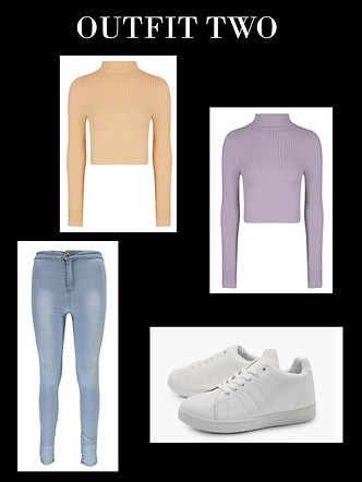
For the main female character I wanted her to be in a simple outfit but still be more of a middle class which compared to the original scene is very different as she is wearing a grey tracksuit and she looks rough and rouged. Whereas I wanted our female lead to be more well presented to match the more middle class location we have.
After talking with the director we have decided to go with outfit two, because we both like the pastel colours and the simple vest top as it doesn't stand out too much and we feel that it will work the best during the scene.


bottom of page